Notice anything different? Our website got a makeover! We’re thrilled to share this new site with visitors and give you a behind-the-scenes of how the project originated and what led to this final execution.
The Project
We figured if our marketing team was growing frustrated with maintaining our website, our users were probably frustrated with using our website. We have a team of engineers and account managers full of knowledge about the foam and mattress industry, yet our website was not helping us deliver that insight. The resources we had on our site were often hard for users to find. Whether it was explaining machine add-ons or providing in-depth looks into how our designs meet the industry’s needs, we knew we could do a better job of presenting those details to you.
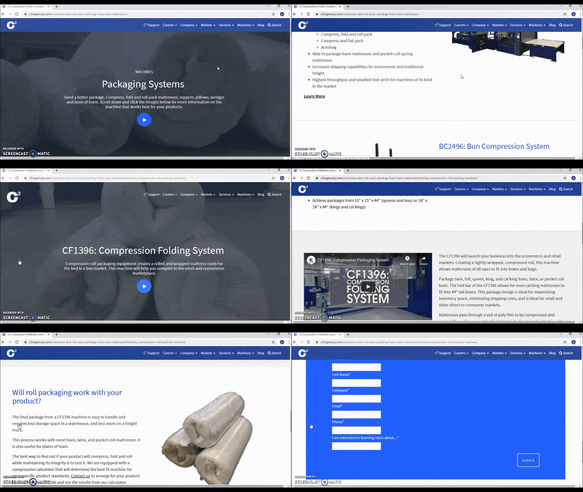
This sparked us to think about how we could deliver an easy-to-navigate site that put the most relevant information front and center for viewers. Most importantly, we wanted our website to become a portal of knowledge – industry best practices, machine information, packaging insights, and help content all available for visitors from the foam and mattress industry to peruse.
The Goal
Our goal with the new website is to create a space for visitors to interact with C3 as a resource. We wanted to deliver information in an accessible and concise way, support multi-channel conversations, and provide helpful content to aid in the decision-making process of purchasing capital investments.
The Process
To reach our goal, we had to look at ourselves in a new light. We’ve done a few regeneration projects before, like our Employee Handbook, and with each initiative we learn more about who we are as a brand and what we stand for. When we stepped back and looked at how we were presenting our products, services, and content online, we realized we were not doing ourselves justice and were probably confusing our visitors.
We worked with a web developer to redesign how we presented ourselves. We wanted easy navigation that seemed intuitive to our visitors and categories that resonated with the foam and mattress industry. We also wanted to help guide visitors to see what types of products each machine works with and how the machines integrate into production lines. We also thought it’d be integral to show extra content that explained the functionality, design, and integration process in more detail for the more curious visitors to do further research.
The Result
This brings us to where you are right now! Welcome to our new website.
What we love about our new site is the crisp, clean, updated look. The homepage features an inviting, animated display of our machinery and people, and encourages users to click the navigation to find what they’re looking for or continue to scroll for more information.
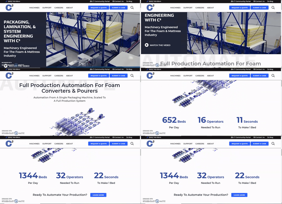
One feature we’re especially proud of is the people showcased throughout the website. On each main page, you’ll see a team of C3 employees who work to engineer and build our machines. You’ll also see faces from business development, service, and other departments throughout. These are the actual people working on your machinery and who you’ll meet when you visit us on-site!
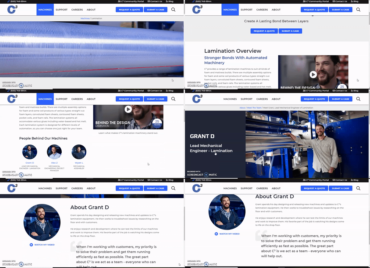
As you look around, here are a few other things we think you’ll find helpful:
- Product examples – On many of the machine pages, you’ll find examples of what that machine can create. In the instance of our mattress packaging machines, you’ll find examples of final package dimensions. Lamination equipment will show recipe examples with details about glue usage and throughput.
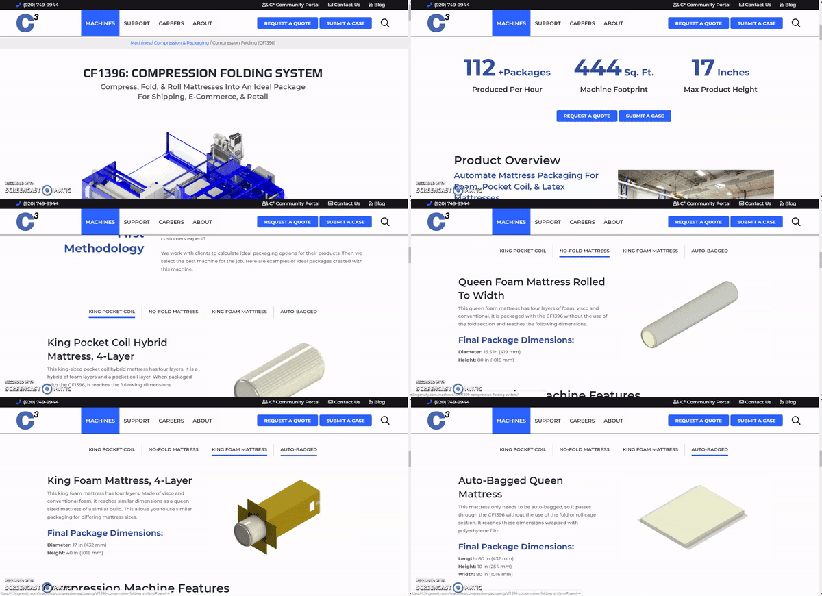
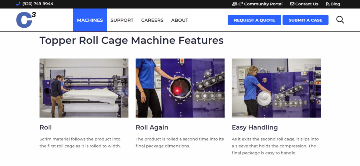
- How It Works – These sections focus on specific features of a design. The Block Compression page, for example, highlights the Compress, Seal, and Roll steps of the packaging process.
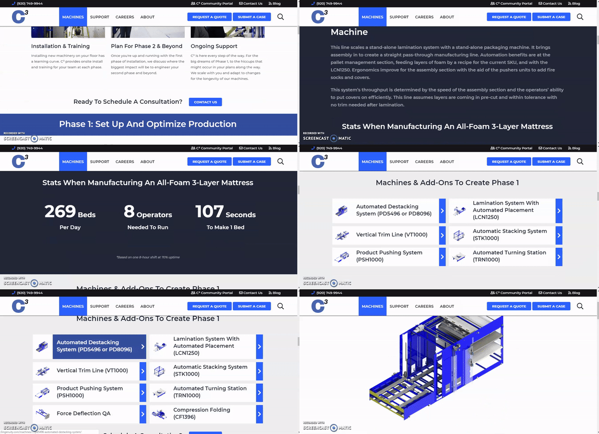
- Systems – Each machine page helps you envision how each of these units ties together so you can see how a machine will work for you now and it’s potential for the future.
- FAQ’s – We’ve taken common questions and addressed them up-front, making it easier for you to choose the right equipment for your needs.
- Featured content – We’ve created tons of additional material like magazines, blogs, and videos to give you a deeper understanding of our designs. The most relevant ones are now available on each page for you to dive into and learn more.
The Future
Joe is known for saying, “A good design keeps giving” – by that, he means a good design should set you up for growth. It’s no surprise, then, that our marketing team already has plans for building upon this new site. We are excited to invest more into the support side of the site and launch things like a community portal, how-to content, and more. We also look to build a product-selection tool to help you make better decisions about what machinery suits your business before you ever have to talk to our account managers.
We hope you enjoy using the site as much as we do! Reach out with any questions or feedback to [email protected].
